17-02-2017
It’s often said that there’s no substitute for experience - but there are shortcuts to it. We spoke to seasoned developers; people who toil over. This collection of tips comes straight from the code-face.
Overflowing like an inadequately specified buffer, a googolplex of know-how has been filtered to bring you 25 fine features, tricks, and tips. There are open-source services that developers keep quiet about, mobile programming hacks and responsive development tips.
We’d heard a few of these stellar secrets before, but many brands new to us. We’re sure that you’ll find more than one or two to add your toolbelt.
Coding
1. Clear lists
Clearing floating elements is part of the grind for most web developers. We can still get caught out though. For example, how do you clear floated list elements without setting a height? “The answer to this little dilemma is simple,” says Rhys Little of Plug and Play, “Just add the following two CSS properties to any list container with floated list elements.”
display: block;overflow: hidden;
If you check the list container now with any DOM inspector you’ll find that the height attribute has automatically been calculated - and that fixes the issue.
2. Sandbox
If you want to develop techniques, CSS effects or new kinds of transition, for example, do it as a sandbox project. “Keeping experimentation uncluttered by outside influences makes the code much easier to debug if something isn't working as expected,” says Creative Director Shane S. Mielke.
3. Web inspectors
Developers differ on the best web inspector, but they all agree that we struggled before our favourite browsers had them. New Context’s Paul Wilson points out that you can preview CSS changes live in Chrome or Safari. Right-click on an element, and choose ‘Inspect Element’, says Wilson, “All the applied CSS will be shown in the right inspection pane. You can edit or add new elements here, to see the effects of your changes.”
The web inspector isn’t accessible by default in Safari on the Mac. Enable it by going to Preferences >Advanced>Show Develop menu in the menu bar.
4. Firebug and beyond
Chrome and Safari have a web inspector built-in, but Mike Ballan, Digital Designer at Jellyfish stands by the original Firefox Developers Toolbar. “It’s the perfect thing to detect those little CSS problems when testing your site in multiple screen sizes,” says Mike.
“Firebug has just added the ability to display multiple screen sizes in one browser tab too - which means you will never need to change your browser’s width to test your site again."
5. One thing at a time
Ben Howdle, developer of Didlr at wapple.net/, says he cannot stress the importance of the Single Responsibility Principle enough. “Every object in your code should have one function. Even with CSS. Don't put all styles onto a button class. Split it into .button-structure and .button-face and so on...”
Why? Because if you don’t do that and there is something break, you’ll have a heck of time tracing back through your code, finding which object is the problem - and whether the bug is inherited from higher in the DOM.
6. Can you code it?
Ben also thinks that falling back on frameworks and libraries isn’t always the best answer. “If you're coding a small project and always, for example, include jQuery, think ‘Can I do this with Vanilla JS?’” You may find that, indeed, you can do it in JavaScript, better and faster.
Project Management
7. Get Git
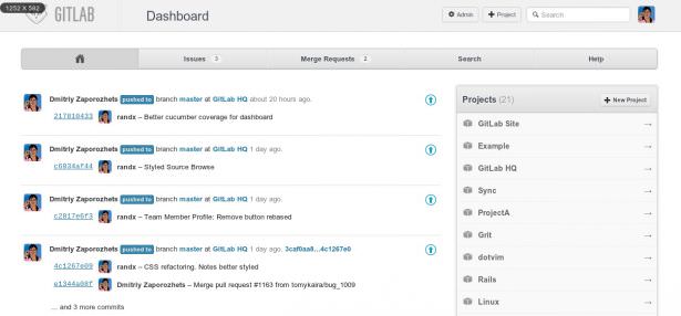
If you’re working on big projects, you need a robust versioning system. Many devs swear by GitHub, but there’s a downside if your project is private. Your code is hosted on GitHub’s servers and publicly available. The folks at Plug and Play recommend gitlabhq.
“GitLab is very similar to GitHub but is completely open-source and free to set up on your servers,” says Rhys Little. “The best set-up for GitLab is to use NGINX with the unicorn to improve performance and speed - but Apache with Passenger will work as well.
“The biggest advantage of this arrangement is that your code is backed up each time you commit, with a really useful diff viewer so you can see what has been changed on each commitment.”
8. Commented code
Team workers, in particular, remember that other people need to understand your code - use your resources and work through your files. “Don't be Lazy,” says Shane S. Mielke. “Always comment on your code, name your layers and organize your PSDs and FLAs. The more organized your files are the easier it is for you or others to jump in and understand where things are at and how they work.”
9. Secure your site
Before you go live with a website, be sure to run it through ASafaWeb.com(pronounced A-Safer-Web). “This site, written by Microsoft MVP Troy Hunt, scans ASP.NET websites for a range of common security issues,” says .NET dev Macs Dickinson. “Should you fail any of the tests, it will advise you how to resolve the problem.”
10. Automate
“Don’t waste time deploying or manually running unit tests. Automate it,” says Macs, “Time spent getting to grips with NAnt or MSBuild is time well spent as it will decrease the number of hoops you need to jump through when that deadline is looming.”
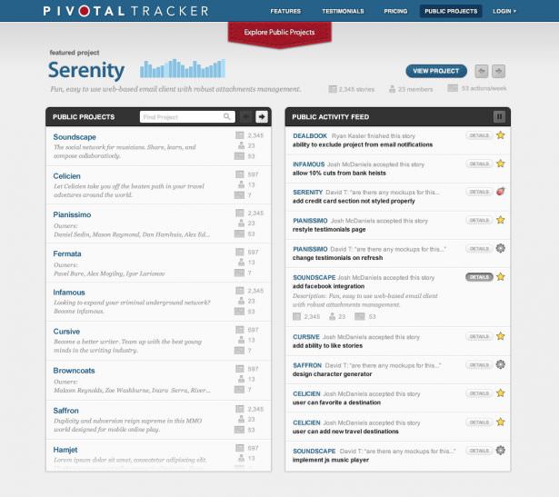
11. Team tracker
The team at Unboxed Consulting uses Pivotal Tracker and Pivotal Booster for project management and feature/bug tracking. “There are other tools for this but Pivotal Tracker is a simple, lightweight option,” the team told us. “We regularly use it to track progress through projects.”
12. Perfect pictures
Pixel Perfect is a tool Unboxed uses for comparison of initial designs with the actual front-end that the development process spits out. “This little Firefox plugin allows you overlay a jpeg version of your designs right on top of the page,” says the Unboxed team. “You can check down to the last pixel that everything lines up!”
13. Dotted lines
Unboxed has a smart, intuitive idea for tracking progress in coding pages. “Sometimes working on the front end we use an ‘incomplete’ or ‘todo’ CSS class which gives a dotted outline to elements which don’t work or are unfinished,” the team tells us. “We can see what needs work before going live.”
Mobile
14. Active phone numbers
“Most mobile devices can make calls, so take advantage of that in your page code,” says Mike Ballan. Wrap the number in the tag. Instead of Http:// as the protocol you use “tel:”
Here’s what that might look like:
15. High or low?
Is your site ready for retina screens? Don’t think you’re OK just because the numbers are on your side right now, because it won’t stay that way forever.
“There are a couple of solutions for switching images depending on the response to screen resolution,” says Mike. “There’s the JavaScript framework retina.js which uses Apple’s @2x naming convention to swap out standard images with hi-res versions.
“It’s also possible to supply high-res images to iOS devices using Webkit-image-set”. Here’s how:
.header { background: -webkit-image-set( url(images/header.jpg) 1x, url(images/header_2x.jpg) 2x);}
16. Fixed position
Want to have fixed navigation or a contact bar at the bottom of your site? When it comes to mobile, you’ll have to keep in mind that only a few browsers support the ‘fixed’ class. “Windows Phone 7 will replace the ‘fixed’ class with ‘static’ - which isn’t a good thing,” says Mike.
Here’s his list of mobile operating systems that support the ‘fixed’ attribute in CSS:
- Mobile Safari iOS5 and above
- Android 3 and above
- Blackberry 7.0 and above
Shortcuts
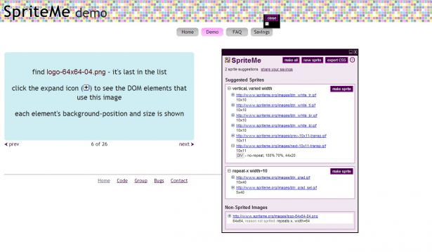
17. Sprite me
Turn buttons, icons, and backgrounds into sprites to speed up page downloads. Combining multiple images into one file reduces the number of requests the client must make to your server. “Some developers will group images by type,” says Rhys Little, “Others will just combine everything into one file”.
You then use the CSS background-position attribute to just show the portion of the image you want. The image download once cached and requested once. If that sounds like too much hard work, use online tool spriteme.org to do the donkey work. It scans your page for images it can combine and generates the CSS for you.
18. White space
“Shrinking down the white space and even function names of your JavaScript and CSS will greatly reduce your page load times,” says Rhys. He suggests combining all your JavaScript and CSS into one or two files, then passing those files through YUI Compressor.
19. Actions
Even designers forget how easy Photoshop Actions can make their lives. Developers won’t forget this one: Photoshop Web Workflow.
“Once installed, you click on any layer in Photoshop and hit the F1 key,” says Paul Wilson, “This grabs the layer, puts it in a new document that is the exact dimensions and brings up the Save for Web window”.
A simple sounding sequence, but that will make background creation, prototyping and sprite making much faster
20. If then
Keir Whitaker of Viewport Industries can’t live without Mac applicationTextExpander: “It allows you to assign shortcuts to big chunks of text. For example, if I want to output the WordPress loop in my code editor I simply type // loop. It works system-wide and is a great tool for building time-consuming code structures, like nested lists.
21. Refreshed
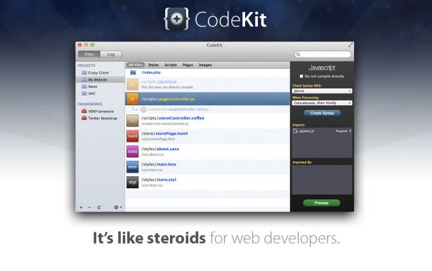
Keir is also a fan of CodeKit “If you are on a Mac then CodeKit is a must,” he says, “ The browser reloading feature is worth the small cost alone. It’s also great for image optimization and compiling Sass and JavaScript.
22. You’ve all got mail
“It's a full-time job maintaining your app's mailing function, so save yourself a headache and outsource it,” says UX Developer Will Grant. Services like SendGrid or Mandrill handle deliverability, spam protection, bounce reports - the lot. “These things are super-cheap or even free for your first few thousands of emails.”
Responsive sites
23. Media queries
“When building responsive sites, media queries are the backbone of the process,” says Mike Ballan, “They match the media type of your device and display the CSS you have to declare”. For example:
body { text-color:#000000; }@media only screen and (min-width:1200px) {body { text-color:#FF0000; }}
The code above traps screen resolutions at 1200px or higher and applies the colour red to all body text on the page. If the screen size is less than 1200px it will display black body text.
So far, so simple - but seasoned devs know that this process can soon get cumbersome as you struggle to please all of the people all of the time.
“Use a CSS Framework like Amazium,” says Mike. It replaces the need to write a billion different media queries with simple, semantic classes
24. A heavier choice
If a more heavyweight framework is required then twitter.github or ZURB’s Foundation might do the trick.
25. Turn things off
“When making responsive sites, you don’t want users to be able to double-tap and zoom, as all your content should be visible,” says Mike Ballan, “To do this you will need to add some code that disables user zooming and scaling”.
This code will also enable iOS devices to display sites more elegantly when the iPad or iPhone is rotated.
Read more about Top 10 Web Design Topics \ The best web design company in Egypt


